TokyoDev has a new logo!

Mathieu Mayer
Over the last four years, I’ve been helping TokyoDev with UX, design, and frontend development. One project I’ve been working on is improving our branding. Today, I’m delighted to introduce the results of it: TokyoDev’s new logo.
![]()
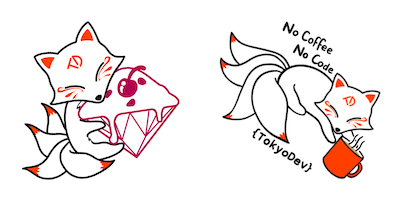
This new, fun and quirky, logo changes pretty much everything about our branding.
The logotype is 100% custom made and is not derived from an existing typeface. Bold and slanted, we intend it to represent the passion and dynamism that we have for what we do.
The logomark is derived from an original character designed by our very own Michelle Tan representing a celestial fox. We wanted to add a friendly face to our site that could embody the TokyoDev spirit: agile, swift, playful and adaptable.
In the coming years, our celestial fox will follow us around and we hope to bring its magical touch to our next projects.
In this article, I will try to tell you more about how we came up with this idea and our cooperative design process.
TokyoDev’s branding challenge
Paul started TokyoDev as his personal blog in 2010, and so when it started, he was the brand. I first got involved in the project four years ago, after I got a message from Paul saying that he’d made a job board page on his blog, but the design was quite rough, and so he was looking for my help improving it.
What was then “just” a blog needed to become a little bigger than that, and so I came up with a new design that would put the job board front and center.
When we first tackled that redesign, we thought of it as utilitarian. We wanted to make it fast, compact, and accessible. In other words, we wanted to vanish behind the “tool”, and TokyoDev as a brand was not an urgent preoccupation for us. A clear sign of that was that we never made a proper logo for it. Rather, we slapped two curly brackets around the site’s title and called it a day. It was mostly fine to us.
As the site grew though, our lack of branding presented us with several challenges.
First, TokyoDev was moving beyond just being a job board. We’d created our Discord community, we were hosting events online and offline, sponsoring diverse communities in Japan, and commissioning outside contributors to share their knowledge of working in Japan. Not having a cohesive brand made it harder for us to tie all these pieces together.
Second, since we launched the TokyoDev job board, a competitor with a very similar name to us emerged, which led to us being confused for them and vice versa. Not an ideal situation for either of our businesses, and so we wanted to better be able to distinguish ourselves.
Third, TokyoDev as a name didn’t fully represent what we were doing. As a site, we wanted to support international developers all across Japan, not just those in Tokyo. Changing names came up as an option but we ultimately decided to stay as TokyoDev.
Finally, we felt that our utilitarian, text-heavy approach was a mismatch with our team personality.
What we wanted the TokyoDev branding to convey
Branding could only help us better convey who we already were. But we wanted to be intentional about what aspects of ourselves we were going to emphasize. So we sat and tried to define who we are as a company, what we do, what our objectives are.
- We are developers working for developers
- We help developers who want to work in Japan
- We want to support the developer community in Japan
- We are approachable, honest and friendly
Renaming the site
Some of our branding challenges could have been solved by renaming the site to something else. While we considered this, we also quickly abandoned the idea.
While the name wasn’t ideal from some perspectives, it was good in others. Maybe it missed out on some nuance, but it was short, and quickly conveyed to developers that it was a place for them. We’d also already built up a large audience in the decade plus the site had been around, and there was also a great deal of sentimentality around it.
So we decided to leave the name as is, and instead see if we could tackle our branding challenges in another way.
Introducing a mascot
The next approach we tried was coming up with a mascot. Not only was imaging a character fun, but we thought it could bring a number of advantages.
- A character would allow us to make custom illustrations for the site depicting real life situations
- We could maybe give it a name and customize it for different occasions
- It would also help naturally show TokyoDev as a group of human beings working on helping others achieve their goals
That last one was particularly important to me because to be quite honest, I’m not very fond of how cold and dehumanized job marketplaces can be. Even in a sector as dynamic as ours, looking for a job isn’t always a good time.
We started brainstorming asynchronously on Slack about what kind of character we imagined working for TokyoDev. Possibilities were almost endless but we quickly decided that whatever character we chose should have a special link with Japan. For example, a TokyoDev Kappa Rubber Ducky was discussed early on! We were all interested in a legendary or mythical creature but with all sorts of quirky tweaks.
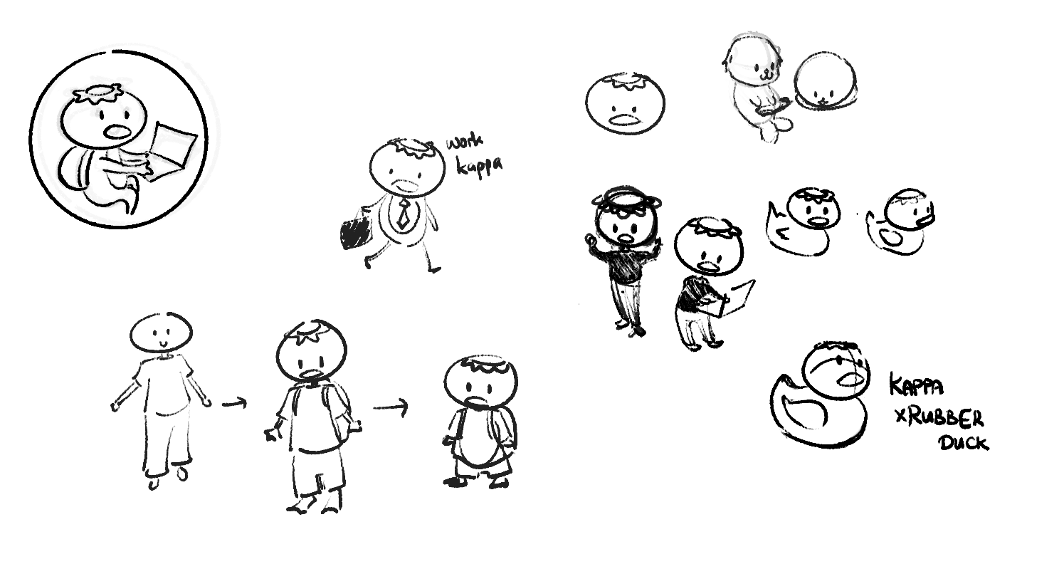
This is where Michelle Tan, a developer working with us, really had a chance to shine. Unlike Paul and myself, she is really good at drawing! She helped us not only with ideation, but also with coming up with characters themselves.
We ended up reaching a consensus on a celestial fox-type character. We thought that in addition to being cute, the qualities generally associated with foxes, such as intelligence, agility, and adaptability, were a good match with ourselves and our audience.
Michelle worked on creating this character from the ground up.
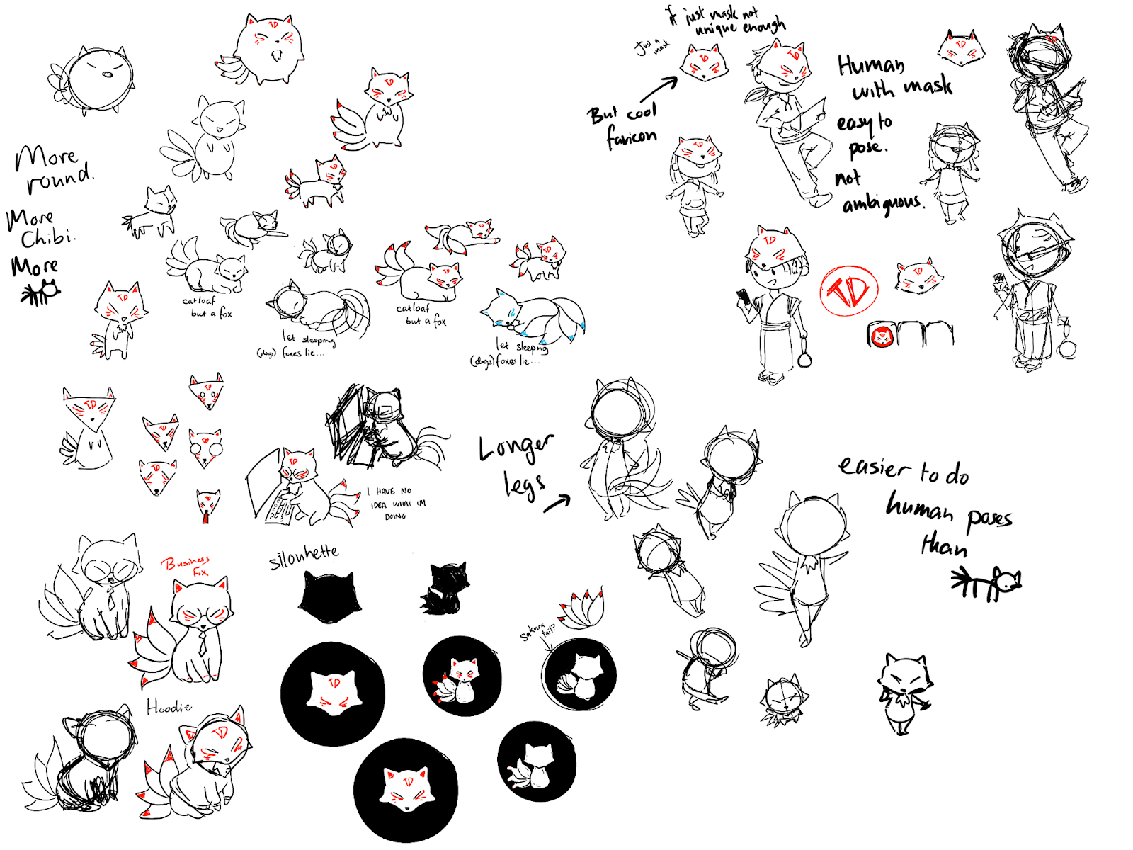
As you can see, early versions of our fox looked already pretty close to our final logo. We thought it was super cute and were eager to see it develop on stickers. Michelle immediately started working on collaborative stickers with some community events we attended.
From mascot to logo
While the character worked great as a mascot, I felt it had too many details to work well as a logo mark. So we tried simplifying and trimming details, but as we removed them, the design became more ambiguous, something that could have been a fox or a dog or a cat or even a pokemon.
We had hit a wall. It was clear to me we lacked the experience to turn an original character creation into a professional logo. I was really proud of how far we’d come on our own, but it was time to admit we could use some help. So we turned to a professional to take our idea across the finish line.
We’re delighted that our new mascot and logo reflect the essence of who we are and where we see ourselves heading. We’re looking forward to seeing where this little fox will lead us and hope you’ll enjoy and welcome it just as much as we do.